
In Single-Cell and Spatial Transcriptomics, figures are more than illustrations—they translate complex datasets into biological meaning. From UMAP clustering and heatmaps to pseudotime analysis and cell–cell communication, each visualization type reveals different aspects of cellular diversity and tissue organization.
This guide highlights common figure types in single-cell and spatial transcriptomics research and explains how to read them quickly and accurately.
A technical workflow figure often shows whether the study uses single-cell or spatial transcriptomics.
Single-cell: Tissue dissociation → single-cell suspension → microfluidics → sequencing, often with droplet-based chip diagrams.
Spatial transcriptomics: Tissue sectioning → spatial hybridization → H&E staining, plus platform chip images (e.g., 10x Visium).
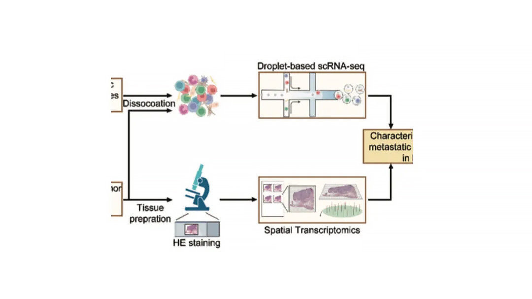
Tip: If both workflows appear, the study likely integrates single-cell and spatial data for combined analysis.
These figures define how cells are grouped, annotated, and characterized, forming the foundation for downstream analysis.
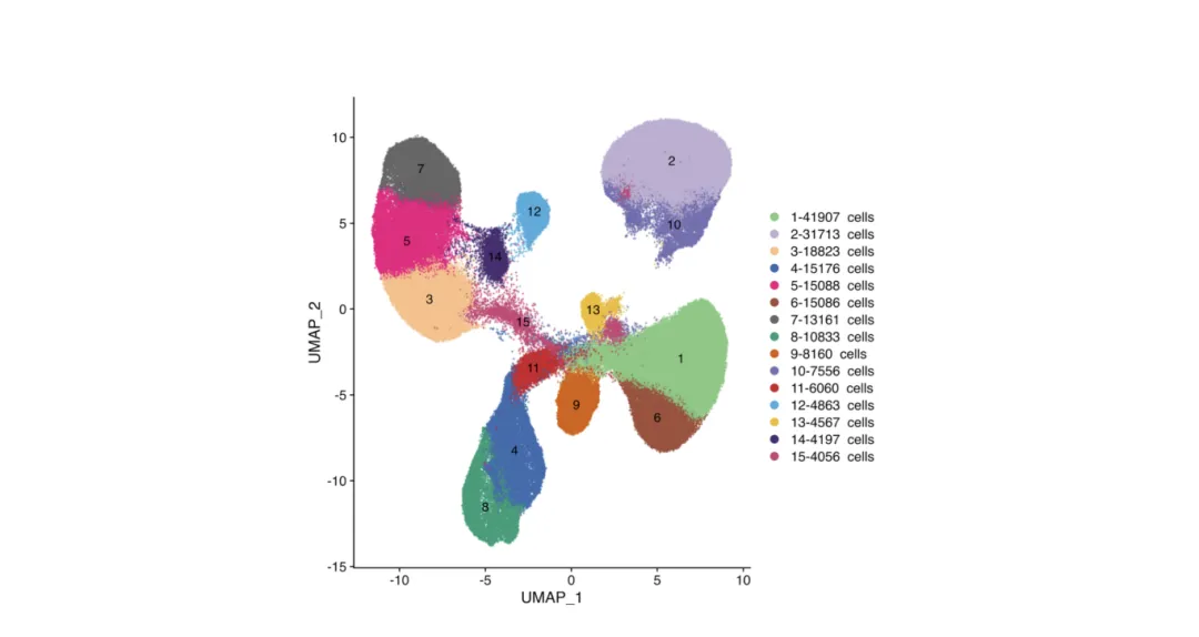
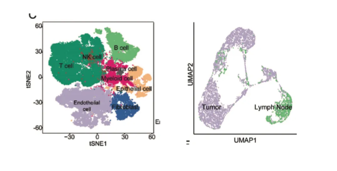
UMAP and t-SNE plots are standard in single-cell analysis and increasingly common in spatial transcriptomics integration.
Purpose:
Reduce high-dimensional gene expression data into 2D or 3D space to visualize cell-to-cell relationships.
How to read:
Each point = one cell.
Colors may indicate:
Cluster IDs (e.g., Cluster 1, 2, 3…)
Cell types (e.g., T cells, B cells, macrophages)
Sample groups (e.g., tumor vs. normal)
Gene expression levels for a selected marker.
Advanced uses:
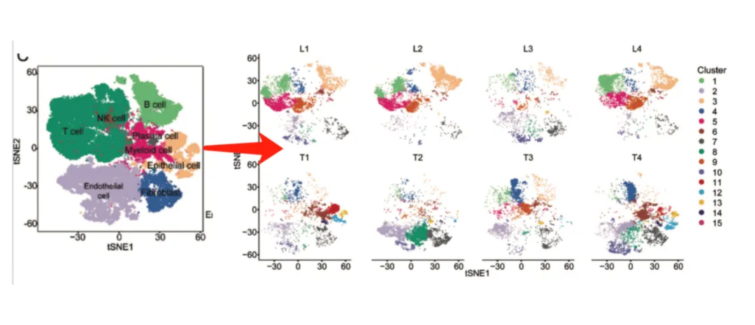
Faceted by sample: Highlights clusters unique to certain conditions.
Cell type annotation: Assign identities based on canonical markers (e.g., CD3E for T cells, CD19 for B cells). Avoid assuming “cluster = cell type” without marker validation.
These plots act as a GPS for identifying functional cell populations, showing where and how strongly genes are expressed.
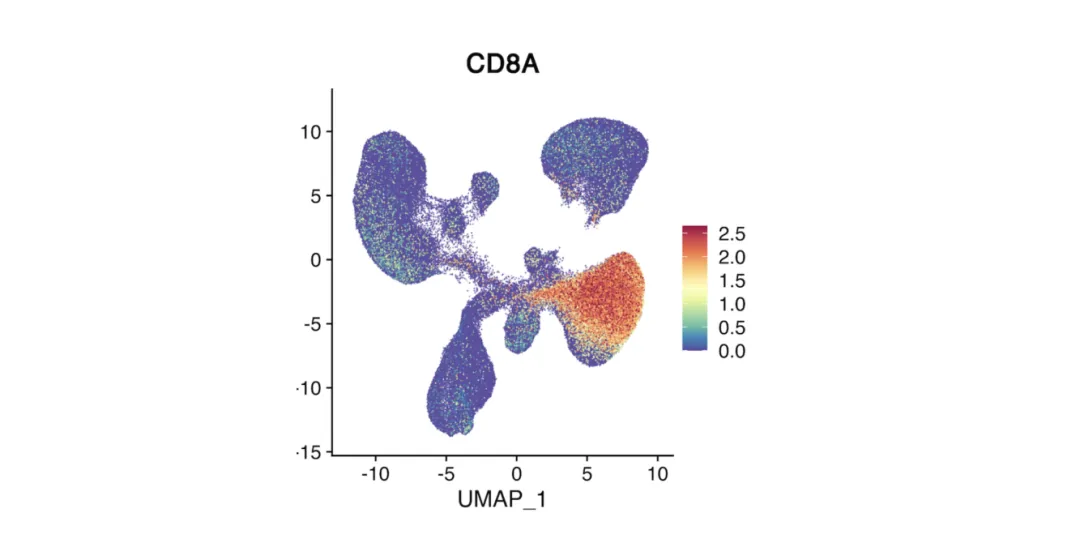
Feature Plot
Overlays the expression of a single gene on a UMAP or t-SNE plot.
Color intensity represents expression level (warmer = higher).
Pinpoints the location of cells expressing a gene of interest.
Often used to check whether a cluster matches the expected cell type based on marker expression.
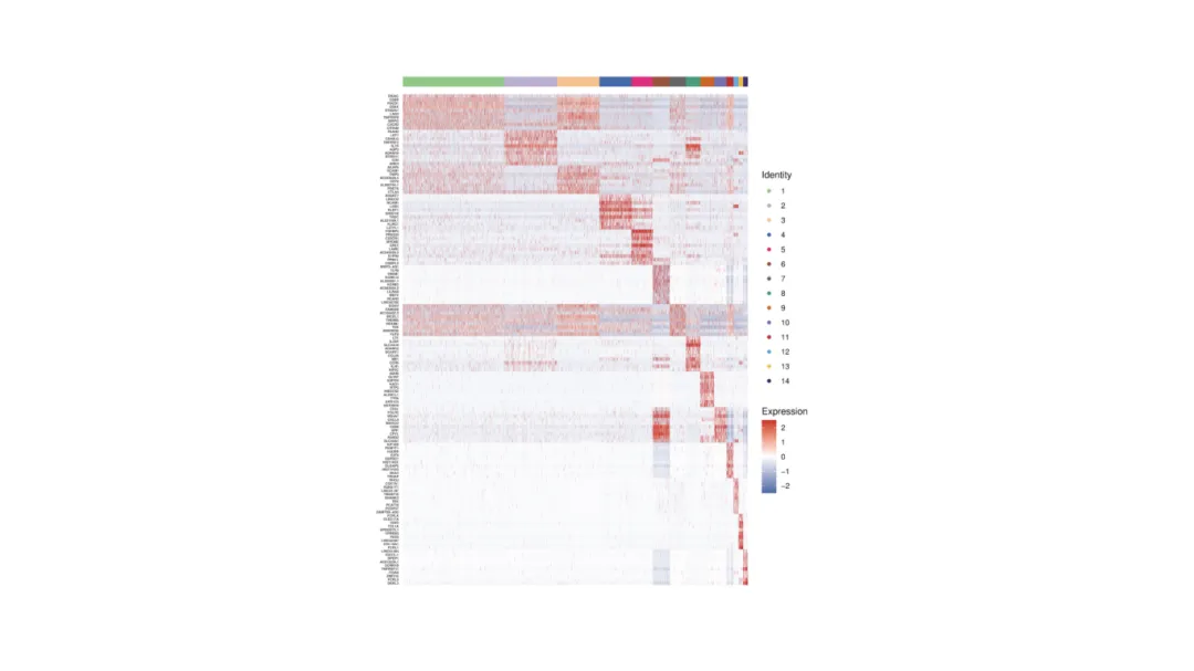
Heatmap
Shows expression patterns of multiple genes across clusters or samples.
Rows = clusters or samples.
Columns = selected genes.
Color gradient indicates relative expression level.
Often arranged by hierarchical clustering to reveal related cell groups and signatures.
Heatmap of top marker genes across immune cell clusters reveals lineage-specific expression.
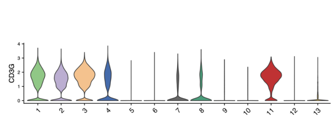
Violin Plot / Box Plot
Displays the distribution of a gene’s expression across clusters.
Violin plot: Width = cell density; height = expression range.
Box plot: Highlights median, quartiles, and outliers.
Useful for comparing variability between cell types.
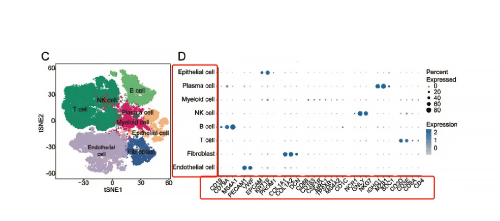
Dot (Bubble) Plot
Summarizes expression of multiple genes across clusters.
Size = proportion of cells expressing the gene.
Color intensity = average expression level.
Ideal for displaying panels of marker genes in one view.
_Plot_.webp)
1. Start with clustering (UMAP/t-SNE) → validate with heatmaps or dot plots.
2. Use consistent color scales (red/high, blue/low) to avoid confusion.
3. Multi-panel layouts combining clustering and marker plots speed interpretation.
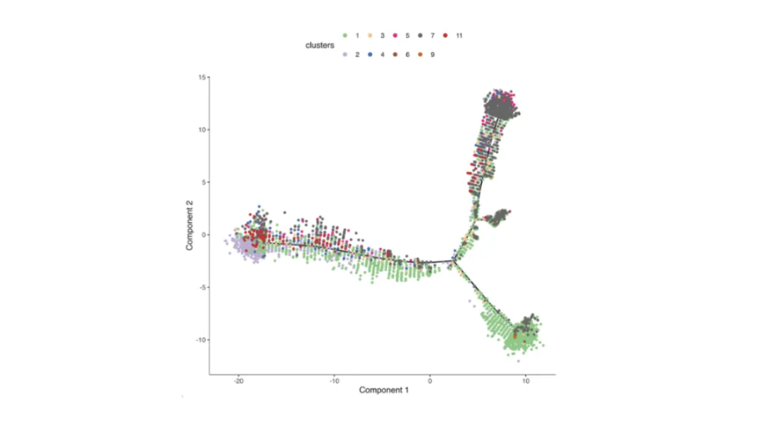
Purpose: Model gradual changes in cell states, such as differentiation or activation, based on transcriptomic similarity.
How it’s generated: Algorithms such as Monocle, Slingshot, or scVelo compute cell-to-cell distances and arrange them along inferred trajectories.
How to read:
Lines = developmental or activation paths.
Colors = pseudotime rank, discrete stages, or expression gradients of key genes.
Branch points suggest alternative differentiation outcomes.
Tip: Cross-check inferred order with known biology, as computational results can be dataset-dependent.
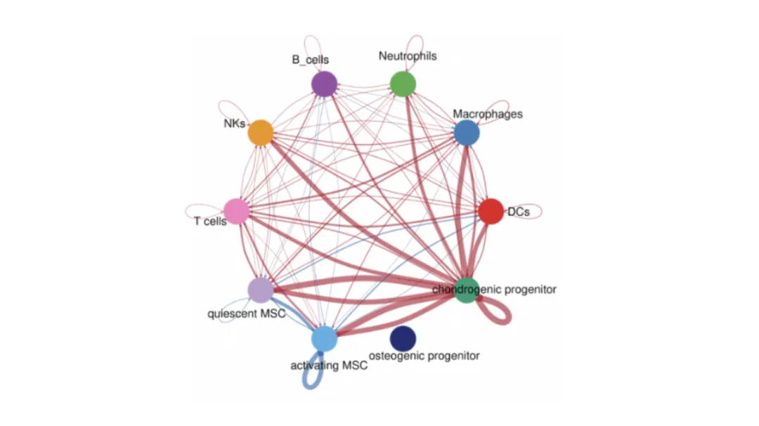
Predict functional interactions between populations using known ligand–receptor pairs. Tools include CellPhoneDB, CellChat, and NicheNet.
Nodes = cell populations.
Edges = predicted interactions, weighted by strength or frequency.
Pathway annotations (GO/KEGG) can highlight biological themes.
Axes = sender and receiver cell types.
Size = proportion or number of significant ligand–receptor pairs.
Color = statistical significance or interaction strength.
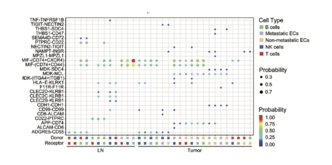
Tip: Compare with spatial data to see if predicted interactions occur in neighboring cells.
Figures in single-cell and spatial transcriptomics work best when sequenced to guide readers from broad population structure to fine-grained biological mechanisms.
Example workflow:
1. Identify populations – UMAP/t-SNE clustering.
2. Validate markers – Feature plots, heatmaps, or dot plots.
3. Explore dynamics – Pseudotime trajectories.
4. Understand interactions – Network or bubble plots.
5. Confirm in space – Spatial transcriptomics maps.
This progression links cell identity → functional state → spatial organization, creating a clear and logical narrative.
In Single-Cell and Spatial Transcriptomics, figures are more than visual summaries—they are analytical tools that connect sequencing data to biological insight. Understanding how to read UMAPs, feature plots, heatmaps, pseudotime trajectories, and communication networks allows researchers to interpret studies faster and present their own work with clarity.
Mastering these visualization techniques is essential for making sense of complex single-cell and spatial data. At Omics Empower, we use these same approaches in our service projects—turning raw data into clear, publication-ready insights for researchers worldwide.
Our laboratory platforms include 10x Genomics Chromium, Visium, and Xenium for high-throughput single-cell and spatial transcriptomics, BGI Stereo-seq for ultra-high resolution spatial mapping, and MobiDrop for flexible microfluidic-based single-cell analysis.
If you need Single-Cell and Spatial Transcriptomics analysis like the examples in this blog, our team can help design the workflow, generate high-quality data, and deliver actionable results.
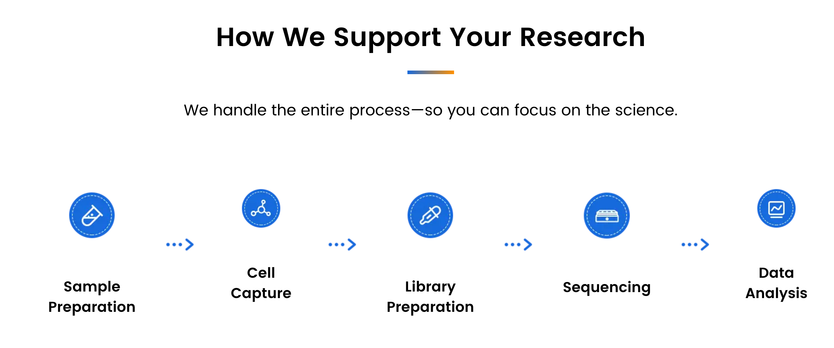
Since 2018, Omics Empower has been delivering specialized research services in single-cell and spatial transcriptomics.
We support academic labs, biotech companies, and research hospitals with reliable, full-process project execution—from sample preparation to bioinformatics analysis.
With labs across Asia, Europe, and North America, we offer localized project handling, quicker turnaround times, and responsive communication throughout every stage.
Germany: Arnold-Graffi-Haus / D85 Robert-Rössle-Straße 10 13125 Berlin
United States: (CA) 2 Goddard, Irvine, CA 92618
United States: (IL) 8255 Lemont Rd, #1, Darien, IL 60561
Hong Kong: Room 618, Building 6, Hong Kong Science Park, Pak Shek Kok, Hong Kong
Germany: Arnold-Graffi-Haus / D85 Robert-Rössle-Straße 10 13125 Berlin
United States: (CA) 2 Goddard, Irvine, CA 92618
United States: (IL) 8255 Lemont Rd, #1, Darien, IL 60561
Hong Kong: Room 618, Building 6, Hong Kong Science Park, Pak Shek Kok, Hong Kong